By William Cox – KSD
I’ve known Kirby Stephens for years. Writing about him turned out to be harder than I expected — mostly because every time I tried to pin down what makes him so good at what he does, he’d deflect the credit to somebody else.
So here’s my best attempt anyway.
If your first thought is TL;DR, here’s the short version: KSD Kinetic Strategic Design’s Kirby Stephens has been selected to receive the 2026 Master Musicians Festival Lifetime Achievement Award. He’s spent more than four decades building a remarkable design career, including more than thirty years helping shape the visual identity of MMF itself.
If you’ve got another ten minutes, the story behind that award is even better.
When Master Musicians Festival Executive Director Tiffany Finley told Kirby Stephens he had been selected to receive the 2026 MMF Lifetime Achievement Award, his first response was, “Can this be for the studio… not just me?”
That was the moment I knew this story wasn’t really about an award.
Modest yet exceptionally talented, the Somerset native has built a remarkable career through deep community connections, a work ethic inherited from his parents, and a creative curiosity that guides his work. Kirby is the president and owner of KSD Kinetic Strategic Design (formerly Kirby Stephens Design), a firm that has defied the odds.
It’s uncommon for a graphic design studio to thrive in a small rural community, and even more uncommon for one to remain successful for so long: 2026 marks the studio’s 40th anniversary. Yet the longevity of his business is only part of the story. The path that brought Kirby Stephens to this recognition was shaped not only by family, community, and creativity, but by an unwavering commitment to helping others succeed.
Kirby has worked with the Master Musicians Festival from its inception, over three decades ago. But more on that in a bit.
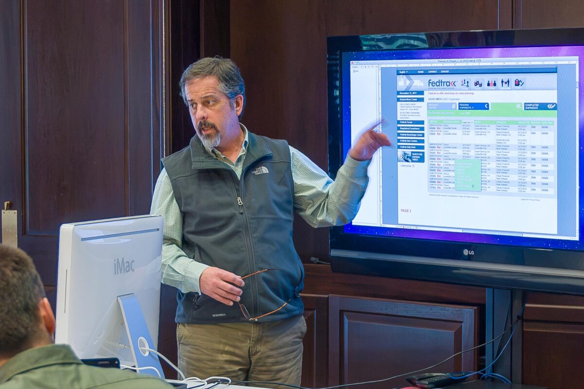
If you are wondering what exactly a graphic design firm does, as Kirby explains it: “We work with our clients to communicate their stories to the people they want to reach.” KSD primarily deals in visual communication. The studio’s experience includes a wide range of projects: branding for U.S.-based corporations with international operations, regional non-profit arts and healthcare groups, interpretive guides for national tourism destinations, signage and wayfinding projects in our hometown and beyond, and websites for a diverse group of companies.
That’s the résumé version. The interesting part is that almost nobody hires Kirby just because he makes things look good. They hire him because he listens.
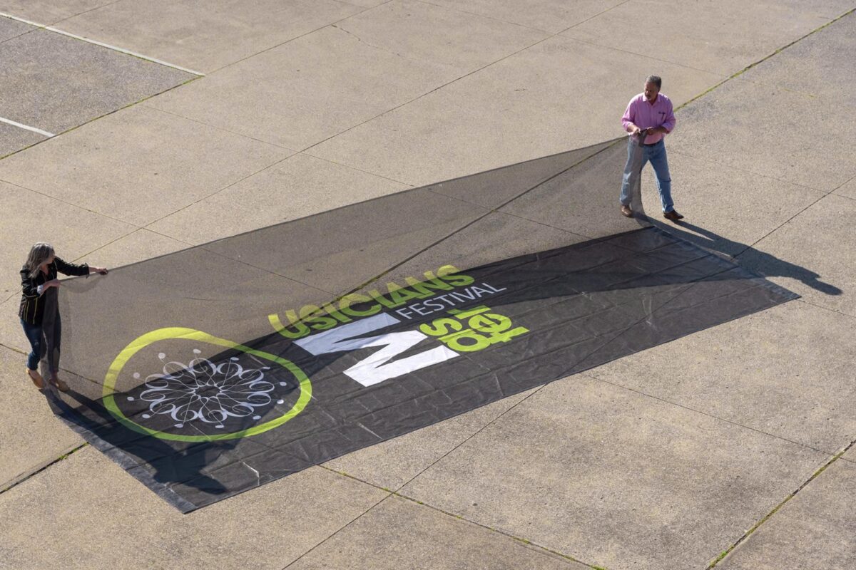
As most festival fans know, the MMF was the concept of Gabrielle Gray, a Somerset musician, author, and good friend of Kirby’s. Gray asked Kirby to design the poster for the first festival in 1994. Since then, KSD has created a number of promotional pieces for the festival, including brochures, stage banners, advertisements, and the design and maintenance of the website.
The MMF was envisioned as a platform to bring a wide variety of musical genres to the local community, to honor master musicians (like Doc Watson and Willie Nelson), and to showcase up-and-coming musical talent. It has certainly done so, but Stephens says it has achieved something more significant: “Under the direction of Tiffany and a dedicated volunteer board of directors, MMF has become part of the fabric of our community, inspiring local musicians and new music venues, while at the same time introducing visitors from across the country to Somerset and the Lake Cumberland region.”
You might start thinking this isn’t really a story about graphic design, or a graphic designer; It’s a story about community. And you’d be right.
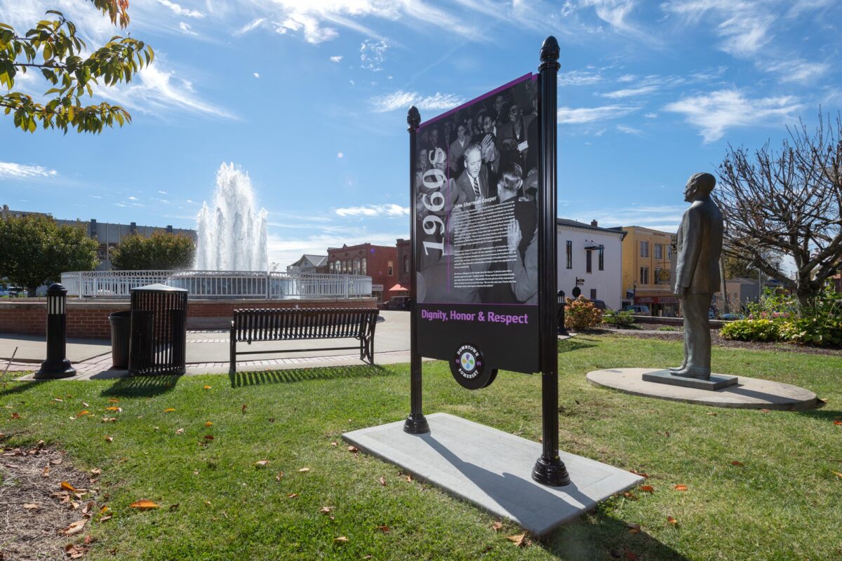
A recent KSD project that appealed to Kirby’s sense of community centered on the design of a historic and wayfinding sign system for the City of Somerset. “The civic life of a city is enriched when its public space is meaningful, interesting, and worth visiting,” Stephens said. “Somerset’s wayfinding and placemaking program offers a physical, public sense of place for visitors and local residents to share.”
The system is designed to welcome and direct visitors to locations in downtown Somerset. It is also designed to reveal connections, highlight the community’s diversity, and demonstrate community pride. “The project was an opportunity to reveal a shared sense of place,” Kirby said. “What I mean by that is we were able to move stories about our community’s rich history from the archives of the historical society, or the recollections of people who are no longer living, out into public view.”
The award-winning designer has seen many changes to his community over the years. “Newberry’s 5 & 10, Garrett’s Tailor Shop, Holsomback’s, Hughes Department Store, Cecil’s Market, Western Auto, the old courthouse, Goldenberg Furniture, Crystal Kitchen, Tibbal’s Drug Store, Salutsky’s. None of these places exist anymore in downtown Somerset. Regretfully, some historic structures, like the old courthouse, were torn down. However, many of the buildings are still there, only with new names and completely new purposes.”
Kirby is the youngest son of Amon and Rosemary Stephens, founders of Amon’s Sugar Shack, which is also celebrating its 75th anniversary this year. Amon’s (originally named Pulaski Bakery) has been a well-regarded fixture in the region since its earliest days in downtown Somerset. Kirby credits the family business for shaping his approach to business: “They worked hard throughout their lives. They cared about the quality of their donuts, pies, cakes, breads, and other pastries. They respected their customers, and they treated their employees fairly and with kindness. The examples of how they made the bakery successful, and how they treated people, were lessons that I carry with me today.”
[Personal side note: Amon’s donuts are still the bomb!]
Stephen’s path into graphic design came through another hometown connection born entirely by chance: Malcolm Grear. Keep Malcolm in mind. We’ll need him in a minute.
In the summer of 1978, as a journalism student at the University of Kentucky, Stephens found himself working as an intern at the Commonwealth Journal in Somerset. (He would eventually return to the CJ to work as the Sunday editor and special section designer for a few years before starting his design firm.) “It was grunt work,” he recalled — proofing and typesetting — but found the whole process fascinating. One day the paper had received a press release from the Veterans Administration about a logo project Malcolm Grear Designers had produced to commemorate the VA’s 50th anniversary (Malcolm was originally from Pulaski County). The press release sat untouched for weeks until one day Kirby asked the editor, George Joplin, if he could take a stab at developing it into a story. He took a chance and cold called the renowned designer.
“We had a lengthy discussion about design in general. The following year, I interned at Malcolm’s studio in Providence, Rhode Island. For the next four years, during the summer, I returned to work at Malcolm Grear Designers and attended the Rhode Island School of Design.”(RISD is widely recognized as one of the world’s preeminent art and design institutions.)
It’s a connection that still shapes how Kirby works today. The same patient, ask-good-questions approach Grear modeled for him on the phone that day is the same approach Kirby brings to every client conversation now, proof that sometimes a cold call changes the whole trajectory of a life.
Over KSD’s 40-year history, the graphic design business has changed. “When I first started my business, I didn’t have a computer.” But the basics of approaching and successfully delivering a client solution have not. “I still believe, when starting a project for a client, that it is critically important to ask a lot of questions — the right questions — to successfully, visually communicate a client’s story so that it will connect with their audiences.”
Ask Kirby about favorite music and you’ll start a conversation. Dave Brubeck. Miles Davis. Norah Jones. Leon Russell. Stevie Wonder. Leonard Cohen. Jon Batiste. The Beatles. (Boss has good taste!)
Ask him his favorite song, though, and he’ll politely refuse.
“My favorite song? That’s impossible. Some songs stick with you because the lyrics have a hopeful and powerful message, like the Beatles’ ‘Blackbird.’ Other songs are important because they remind you of someone, or you associate that song with a time or event. Every time I listen to the lyrics in U2’s song ‘Grace,’ I think of my mother. I get emotional.
“The songs on some albums are transformative. Miles Davis’ Sketches of Spain is one of these arrangements that — if you allow yourself — can transport you to a different time and place,” he said. “Then there are songs like John Prine’s ‘When I Get to Heaven.’ It’s about the afterlife and the things he plans to do there. It’s a little irreverent, mostly joyful, and it’s a lot of fun! I could go on, but you get the idea. I have many favorites.”
Are there similarities between music and graphic design? “Absolutely,” he says. “An artist, or a group of artists, creates a song. Someone listens and responds. I believe this to be the true rhythm of music. I have been a designer for more than four decades, and over that time, my firm has worked with a wide range of clients. We ask each client many questions to gain an understanding of their business or organization in order to tell their stories. In the world of graphic design, this listening and responding — this rhythm — is essential. In our studio, the rhythm of design is expressed as form/counterform, open/closed, separated/touching, parallel/branching, point/line, question/answer, working alone/working together.”
The MMF symbol was not designed by KSD. “You might say that the Master Musicians Festival symbol was stitched in time,” said Stephens. “Each year, MMF features a selected artist’s work to auction off as a fundraiser. One year, local artist Robyn Burkett Baker’s hand-stitched quilt — which featured the treble clef circle design — was one of the most beautiful pieces of art that has been donated. We produced a technical drawing of Robyn’s design for reproduction purposes and began to use it over and over in other promotional materials for the festival. The treble clef design took on a life of its own away from the quilt, and it came to be the graphic symbol of MMF. Rhythmic and intertwined, I can’t think of a better representation of a beloved community music festival.”
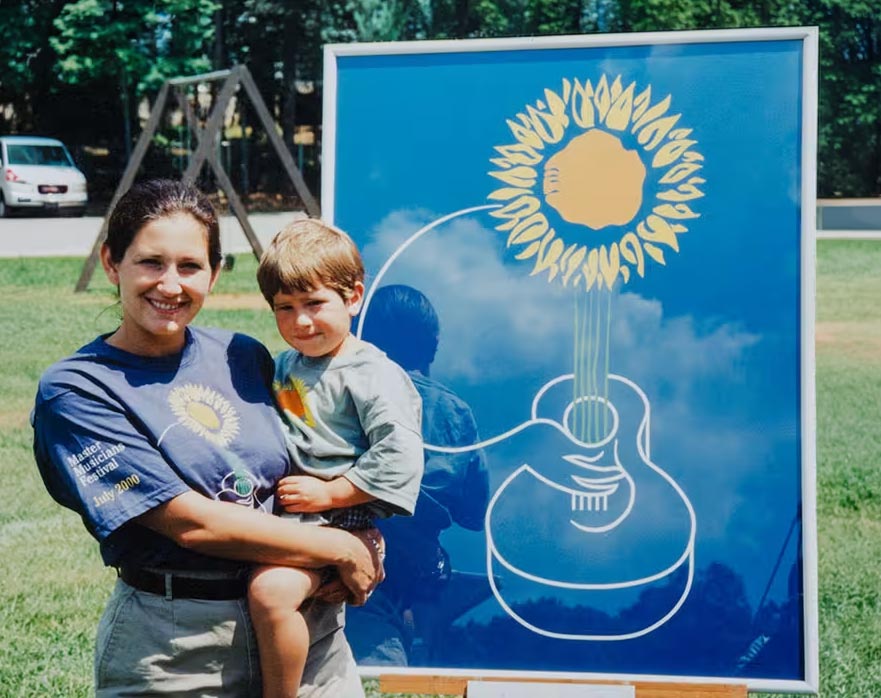
In 2000, when the festival was celebrating its seventh year, Kirby was asked to design the annual artwork to be auctioned off as a fundraiser for the event, and to be used as the image on the festival’s T-shirts, posters, banners, and more. Doc Watson was the Master Musician that year. “I began listening to more of his music and looking at photographs and videos of his fingerpicking guitar style in preparation for creating the festival artwork. After many struggles with how the final artwork would look, I finally felt comfortable showing it to a few critics.”
He showed it to his wife Erin.
She loved it.
He still wasn’t convinced.
So he tried one more critic: his three-year-old son, Isaac.
“It’s a song, Dad.”
Kirby laughed telling me that story. He also admitted that’s when he knew the piece was finished.
KSD believes in the arts. “It’s a theme you’ll see over and over again in our portfolio and the causes we support,” he said. The firm has developed identities and created communications for many arts and cultural organizations, including Lake Cumberland Performing Arts, the Kentucky Guild of Artists & Craftsmen, and, of course, the Master Musicians Festival.
In the late ’80s, Kirby, along with his friends John and Meg McClorey, opened 2days Gallery in Somerset, a gallery that featured Kentucky artists or artists with strong connections to the state. Somerset really rocked at the dance parties following a show opening: 219 East Mt. Vernon Street would vibrate.
Kirby was also among the founders of the Watershed Arts Alliance.
“We’ve been friends a very long time,” said local artist and musician Dan Dutton. I asked Dan, a collaborator and client of KSD, to give me his thoughts on Kirby for this story.
He replied with a list.
“Kirby knows how much I like categories and lists!” he answered with a grin. “The words that came to my mind: Creative. Open. He’s a Disciplined person. He’s a Compassionate person, a Loving person, an Honest person, Quick-witted, Funny, Inspired, and thus Inspiring. Well versed in Art history. Thoughtful, Generous, Spiritual, Kind. I’ve always felt lucky to know him.”
So, about Kirby personally: he’s a huge Boston Red Sox fan. He’s renovated a number of historic houses in Somerset (that’s a whole other story). He likes reading historical biographies, working in his workshop, and gardening. He has children and grandchildren and a big, goofy dog named Winston.
KSD’s success is built on its work. Other than its website, the firm doesn’t advertise. Often, there is one client in the beginning who provides the stability and room for creative flexibility you need to believe you can really make it. For Kirby, that client was Cumberland Valley Cable TV and its president, Al Blakley. “Al gave me the opportunity to design Cumberland Valley Cable’s corporate identity, stationery, service vehicles, headquarters signage, advertising campaigns, and collateral communications, including channel cards, bill inserts, employee manuals, standardized proposal documents, and ad service marketing packages. This work led to other clients, which led to more work. And, as they say…”
Of all the design projects Kirby has worked on, Hospice of Lake Cumberland’s symbol is one dear to his heart. “Early conversations with Gloria Sams and the other founders of Hospice introduced me to a new, enlightened way of thinking about life and death. I drew the Hospice logo using the H letterform, creating a symbol to represent the organization’s support network — patients, family members, nurses, doctors, and community volunteers. They still use this symbol today.

“When my mother died, she was in the care of Hospice of Lake Cumberland. The love, care, and guidance that the nurses, doctor, and other staff provided during that time enabled me to make it through one of the most difficult experiences of my life.”
Kirby summed up the “secret” to his and his firm’s success. “You need more than a good idea or product to build a successful business. You need to work hard and have a bit of talent. You need to surround yourself with honest, talented people. At KSD, I am blessed by working with a group of people who are exceptionally dedicated to and gifted in the talents they bring to the studio. Thank you, Bill Jones, William Cox, and Kim Perkins, for being part of KSD.”
“Can this be for the studio?”
After spending time talking with Kirby and the people who know him, that first response makes even more sense.
Awards may have one name engraved on them, but Kirby has spent forty years making sure other people’s names — and their stories — are the ones people remember.
That’s probably why he wanted the award to belong to the studio.
And it’s probably why it belongs to him.
—
KSD Kinetic Strategic Design can be found on the web at: ksdweb.com

Kirby taking a moment on the shore of the Pacific Ocean following a week-long visit in Seattle, Washington, for a design project with the U.S. Army Corps of Engineers.